Showing posts with label statistics. Show all posts

Sunday, March 29, 2009

Generations

We just got home from one of the sweetest events I've been to in a long time -- a surprise 70th birthday party for an old friend.

This friend is part of the large extended family of folk musicians and dancers that we have fallen in with since we moved to town years ago. For this occasion, our family became even more extended, with folks driving in from hundreds of miles away.

Our local folk community reminds me a bit of Eureka, the TV series about a mythical town in the Pacific Northwest where everyone is a scientific super-brainiac. In our community, however, the norm is that practically everyone you know plays several musical instruments, sings and performs music, dance or some other art.


For this kind of crowd, it long ago became a conditioned reflex to bring an instrument along to any gathering. This means that the usual tasty food and conversation are also well-mixed with great live music and dancing. Several of our gang composed original tunes and dances in honor of our pal and performed them on the spot. It was a hard choice for me between watching them perform and watching the look on his face.

However, the sweetest parts of a very sweet event were when my friend's children sang to him. This began when he walked in the door to find the place filled with friends, a 15-person live band, and his daughter singing Bei Mir Bist Du Shoen. Soon after, his son stood up and sang a touching but funny song he wrote about his long and continuing friendship with his dad. Not too many dry eyes in the house at this point.

We're back home now. Since we got back, I've been wrapping up a statistical analysis, tweaking some lectures and doing a bit of blogging.

As I write this, the sounds of my own son singing and playing his guitar are filtering up from the basement below -- a sound as beautiful as any I've heard today. It gives me high hopes for my own incipient geezerhood...

Saturday, January 24, 2009

Windows: Yesterday's Technology -- Tomorrow!

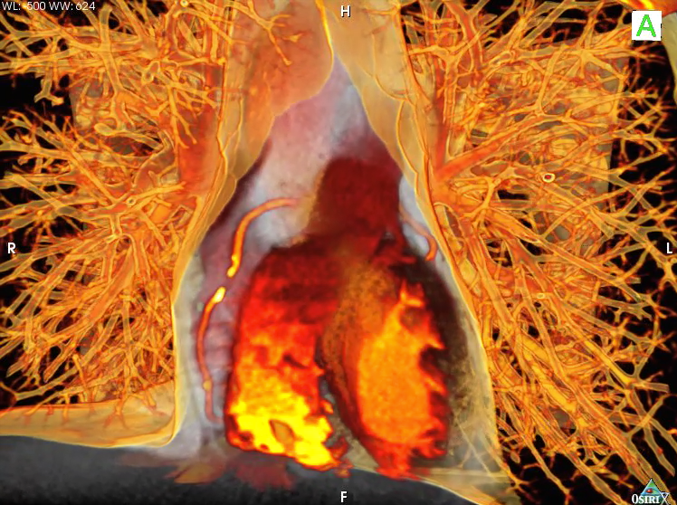
OsiriX-screenshot.png

It takes a lot of computing power to sustain the rockstar lifestyle of an academic radiologist. Whether I'm reading my usual 4 GB of images per day or crunching numbers and statistics for research projects, I'd be dead in the water without my computers.

Therefore, I've spent quite a bit of my academic career dealing with medical center and radiology IT people. We generally get along just fine, but occasionally butt heads.

The main point of contention is that I am a Mac dude. IT has been on my butt for over 20 years to convert my office computer to a PC. However, despite their dire predictions and occasional threats of non-support, I have continued to thwart them. I grudgingly use our PC-based workstations to do my image interpretations, but use a Mac for everything else. It's not just my contrary nature -- the mix of Mac and open source programs I use in my research and teaching either isn't available on the PC (e.g. OsiriX) or isn't as easy to use.

It was therefore interesting to read that other medical centers and the new Obama administration have been having the same difficulties.
One member of the White House new-media team came to work on Tuesday, right after the swearing-in ceremony, only to discover that it was impossible to know which programs could be updated, or even which computers could be used for which purposes. The team members, accustomed to working on Macintoshes, found computers outfitted with six-year-old versions of Microsoft software. Laptops were scarce, assigned to only a few people in the West Wing. The team was left struggling to put closed captions on online videos.
Senior advisers chafed at the new arrangements, which severely limit mobility -- partly by tradition but also for security reasons and to ensure that all official work is preserved under the Presidential Records Act.
"It is kind of like going from an Xbox to an Atari," Obama spokesman Bill Burton said of his new digs.

(via Orac)

Sunday, October 19, 2008

The Blind Men and the Elephant and the Donkey

800px-Blind_monks_examining_an_elephant-Wikipedia.jpg
"Blind monks examining an elephant" by Itcho Hanabusa

Anyone doing medical research for more than 20 minutes soon learns that they can get wildly different results depending on just how they slice and dice their data. A wonderful example of this appeared a few days ago in the New York Times. Tommy McCall, former information graphics editor of Money Magazine, poses an intriguing question in his short op ed piece: Bulls, Bears, Donkeys and Elephants:
Since 1929, Republicans and Democrats have each controlled the presidency for nearly 40 years. So which party has been better for American pocketbooks and capitalism as a whole? Well, here’s an experiment: imagine that during these years you had to invest exclusively under either Democratic or Republican administrations. How would you have fared?
His conclusion, summarized in an impressive-looking graphic:
As of Friday, a $10,000 investment in the S.& P. stock market index would have grown to $11,733 if invested under Republican presidents only, although that would be $51,211 if we exclude Herbert Hoover’s presidency during the Great Depression. Invested under Democratic presidents only, $10,000 would have grown to $300,671 at a compound rate of 8.9 percent over nearly 40 years.
The implication is that the stock market has a very strong liberal bias. Your reaction to this is probably either "Oh, shit!!" or "Dude!!", depending on your political orientation. However, don't touch that dial.

An excellent follow-up post by Theodore Gray, co-founder of Mathematica, gives a quite different picture of this data. Gray created a wonderful interactive model to look at the same question, but using the Dow index (1897 - 2008) rather than the S & P. I downloaded it and had a ton of fun playing with it. Using the same assumptions as McCall, his initial model looks very similar:

1929-no-options.png

However, what if one adds some very basic assumptions to the model? For example, many long term investors plow their stock dividends right back into buying more stock. If anything, this makes the Democrats look a lot better:

ReinvestDividends.png

But wait, there's more.

What if we assume that it takes a while for a new president's policies to take effect? Not an unreasonable assumption, considering that one of the few things with a bigger turning radius than a Humvee or an aircraft carrier is the U.S. economy. What if we allow 12 months for this to happen? What if we also consider the effects of inflation and decide not to blame the whole darned Great Depression on the Republicans? The results now seem to vindicate the red staters:

InflationDividend1Year1932.png

But wait, there's still more!

And, you can read it in the final paragraph of Gray's article. The ending conclusion is too good to spoil here. I will say that I found it really comforting, considering current market conditions.

I guess that the old Sufi/Jainist/Buddhist/Hindu story of the blind men and the elephant is still just as relevant as ever. I'll leave the last word to American poet John Godfrey Saxe (1816 - 1887), who penned one of the best known versions of this tale. The final stanza of his poem says it all...
So oft in theologic wars,
The disputants, I ween,
Rail on in utter ignorance
Of what each other mean,
And prate about an Elephant
Not one of them has seen!

(via TheZorg)

Wednesday, March 5, 2008

X-Rays and Bayes


Most radiologists hate statistics. Heck, most of the people I know with higher education and any sense are still nursing a deep grudge against what little statistics was crammed down their throats years ago. Since I actually enjoy number crunching and data analysis, I am considered somewhat of an outlier in my specialty.

It's becoming harder to be a competent physician these days without some familiarity with basic stats. Even in a show-and-tell field like radiology, one needs to know advanced statistical techniques to fully comprehend at least 20% of the articles in the two major U.S. radiology journals. This statistic is probably much higher in the more fundamentalist specialties, such as internal medicine, where randomized, controlled double-blinded studies are considered holy writ.

Why do people get turned off by statistics? Could it be the dense jargon? The plethora of oddly-named statistical tests? The awkward way that one has to phrase and interpret a simple freaking hypothesis test?

For example, consider the following hypothetical exchange (pun intended) between a clinical researcher and a classical statistician:

Q. Which is more effective -- treatment A or treatment B?

A. The null hypothesis that treatment A is not more effective than treatment B is rejected at the 5% level, i.e. P = 0.05.

Q. Er, um, so in other words, there's a 95% chance that they are different?

A. No. It means that if we were to repeat the analysis a bunch of times, using new data each time, then we would only falsely reject the null hypothesis 5% of the time if it were really true.

Criminy. Even radiologists, normally the Jedi Masters of the weasel word, would be ashamed to hedge this badly in one of their dictations.

Fortunately, there is an alternative -- Bayesian statistics -- that allows one to reject the "reject the null hypothesis" school of statistics and couch hypotheses and conclusions in more familiar terms. Like standard English. The name "Bayesian" comes from Thomas Bayes, a Presbyterian minister and mathematician who died in 1761. His eponymic theorem forms the basis for Bayesian inference, and was published in 1764 by a friend, after Bayes' death.

Hmmmm.... 1764 you say? If this theorem is so darned useful, why didn't we start using it a bit sooner than now?

The main reason seems to be that crunching numbers the Bayesian way can be computationally intensive. By "computationally intensive", I mean "impossible without a computer". Even with today's swift computers, techniques such as Markov chain Monte Carlo (MCMC) can eat up a lot of CPU time.

For those of us who are not statisticians, a Who's-Best argument between classical (frequentist) and Bayesian statisticians can sound a lot like a group of Plain-Bellied and Star-Bellied Sneetches. However, there do seem to be a number of potential benefits to adopting the Wayes of Bayes. To help you decide whether you wish to care further about this topic, there is a very nicely written and non-quantitative (and free) primer online:  Primer on Bayesian Statistics in Health Economics and Outcomes Research by O'Hagan and Luce. I'm up to page 20, myself, and it's a page-turner.

For further reading, Kimball Atwood has posted a great series on the utility of Bayesian statistics in clinical research at the Science-Based Medicine blog. A good place to start reading this series would be here.

For now, I'm off to a prior engagement, probably sitting on my posterior and making my way a bit further through the maze of Bayes.

Wednesday, February 27, 2008

Take the First Chernoff on the Left

There is no topic, no matter how intrinsically tedious or boring, that cannot be made even more tedious and boring with the right set of Bad Powerpoint Slides.
The converse is also true -- a few engaging images can make even a fairly mundane topic sing and dance. Radiology lectures are an obvious exemplar of this, being filled with lots of fascinating images. However, what if you need to present a ton of data? If so, beware -- your task will be a mighty one. Decades of punitive Powerpoints have pretty well proven that any slide with a big table of data is going to have an LD50 of under 30 seconds.

A lot of creativity has gone into solving this problem. One intriguing method was proposed by Herman Chernoff back in 1973 in his paper: "The Use of Faces to Represent Points in k-Dimensional Space Graphically", Journal of the American Statistical Association 1973;68:361-368.

Chernoff's proposal relies on the notion that the human eye-brain combination is one of the most powerful pattern-recognition engines on the planet. If one is trying to convey a large multidimensional table of numbers, he suggested representing each observation as a computer-drawn cartoon of a human face,
...whose features, such as length of nose and curvature of mouth, correspond to components of the point. Thus every multivariate observation is visualized as a computer-drawn face. This presentation makes it easy for the human mind to grasp many of the essential regularities and irregularities present in the data.
For example, consider the following table of totally bogus data that I made up just now, all by myself. It purports to show income level, quality of life and onerousness of call for 4 physician specialties.

  Income Quality of Life Onerousness of Call
Radiology Medium High Medium
Pediatrics Low Medium Low
Family Practice Low Medium High
Surgery High Low High

Yep, this table is a real dozer, all right. But wait! What if we represent the same data as Chernoff faces? To do this, I fired up my copy of Mathematica and used it to run some sample code I downloaded from the Mathworld site (R enthusiasts see here for sample code). In the plot below, the shape of the eyes, mouth and head respectively represent income, quality of life and onerousness of call. My fabricated data now looks something like this:

Of course, this kind of plot has certain potential flaws. As K. S. Park points out:
A major drawback of Chernoff faces is that the subjective assignment of facial expressions to variables affects on the shape of the face.
No feces, Conan-Doyle character. My fabricated and highly biased data, coupled with an equally biased assignment of facial features, makes that first Chernoff on the left look pretty darned appealing, doesn't it?

A discussion of Chernoff faces wouldn't be complete mentioning the work of Eugene Turner, particularly his prize-winning map titled Life in Los Angeles. He has this to say about it:
I compiled and designed this map which was drafted by Richard Doss. It was an idea based on Chernoff faces. It is probably one of the most interesting maps I've created because the expressions evoke an emotional association with the data. Some people don't like that.
Here's one final fun example from the world of baseball: Alex Reisner's What's the Matter with Chernoff Faces, illustrated by his plot of the 2005 National League season. I especially enjoyed the alternative system he suggests there: Reisner faces.


Update, 2/28/08:   I realize that I sort of left things hanging here, with no final socko conclusion rendered on the utility of Chernoff faces.  This is probably because I still don't have a strong opinion.  However, now that I have the machinery to plot these faces, I'll look for ways to apply them to real data and see how they work for me.  My goal is to avoid using them like the person in Andrew Lang's quote, who
...uses statistics as a drunken man uses lamp-posts -- for support rather than illumination.

Monday, February 25, 2008

Graph Fu

See this stunning Flash-based plot on the NY Times site, showing movie box office receipts over time. (via Daring Fireball)

Giving presentations is a big part of the life-blood of academic radiology. Therefore, I'm always looking for cooler and more effective ways of presenting information.

After seeing this lovely Times plot, I'll have to see if I can't convince R, my favorite stat environment, to make some similar plots of my data.
-----------

Update:  For those geeky enough to care, someone else has already worked out how to make R do a very similar plot.